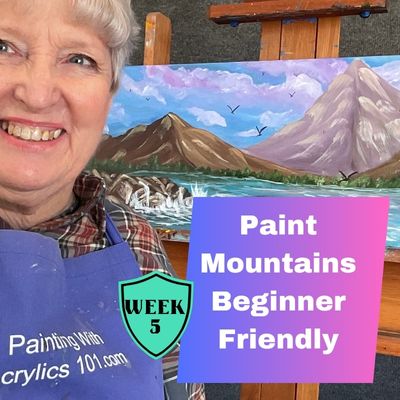
How to Paint Stunning Realistic Mountains: A Beginner’s Guide to Acrylics
How to paint stunning realistic mountains can be one of the most rewarding experiences for beginner artists. With their majestic peaks and ever-changing light, mountains offer endless possibilities for creative expression. If you’re new to painting and wondering how to capture the grandeur of these landscapes, you’re in the right place. In this guide, we’ll explore how to paint mountains with acrylics, focusing on a few key techniques that will help you create stunning, realistic results.
Why Acrylics Are Great for Beginners
If you’re just starting out with painting, acrylics are an excellent medium to work with. Unlike oil paints, which take days to dry, acrylic paints dry quickly, allowing you to make changes and experiment without waiting long periods of time. This is particularly useful for beginners who might be hesitant about committing to a certain approach. If you don’t like how something looks, just let it dry and paint over it! My favorite part of acrylics is they dry quickly!
Acrylics are also more forgiving than watercolors or oils in terms of blending, and they’re versatile, so you can achieve a wide range of textures and effects. This makes them perfect for painting mountains, where you’ll need to create layers, highlights, and shadows to give your scene depth.
Make sure you never miss a single beginner painting lesson by signing up for my weekly one-page newsletter HERE.
Step 1: Creating Distance with Color Values
One of the key challenges when painting mountains is creating a sense of distance. The further away a mountain is, the less detail it will have, and the colors will become more muted and cooler. To achieve this effect, we use “values”—the lightness or darkness of a color. As a beginner, focusing on value will help you create realistic depth without worrying too much about perfecting every detail. If a painting looks off, 95% of the time the problem is in the values.
For distant mountains, you’ll want to use softer, cooler colors, such as purples and blues. This mimics the way mountains in the distance look due to atmospheric perspective, where the air between you and the mountains scatters light, giving them a hazy, muted appearance. Use a light lavender or soft violet mixed with blue and small amounts of white to create a cool tone. Your farthest mountains should be a lighter value, almost pastel-like in comparison to the mountains in the foreground.
As you move closer to the viewer, the colors should shift to warmer, more saturated tones. You can introduce more earth tones like browns and ochres, and the values should be darker and richer. The closer mountains will appear more defined and detailed, with brighter highlights and stronger contrasts.
Step 2: The Importance of Brush Pressure for Highlights and Detail
When painting mountains, especially when you’re adding highlights or intricate details, the pressure you apply to your brush matters more than you might think. It’s tempting to rush through this part of the process, but if you want to create the illusion of depth and texture, adjusting your brush pressure can make all the difference.
For highlights on the mountain peaks—where the light is hitting—use a light touch with a natural bristle brush. Gently drag your brush along the areas where the light would naturally hit, such as the tops of peaks or the ridges facing the light source. If you press too hard, you risk losing the delicate effect of light and shadow, and it can look too harsh or unnatural.
On the other hand, when you’re adding darker areas or shadows, you can apply more pressure and use a larger brush to create soft, blended gradients that suggest the mountain’s ruggedness. These darker areas will help ground your painting, giving it weight and dimension. Be mindful of your brushwork and avoid overworking the paint, as mountains often have bold yet subtle textures that look most effective when you allow some of the underlying layers to show through.
Step 3: Layering for Texture and Detail
Mountains are not just a flat surface; they have texture and form, from jagged rocks to rolling ridgelines. Acrylics are perfect for creating texture because they dry quickly and can be layered. Start with a solid underpainting in a color similar to the finished color of the mountains to define your basic shapes. I like to go darker so the highlights appear contrasting with the dar. Once that layer is dry, you can begin adding colors in layers, working from the background to the foreground.
For distant mountains, you’ll want to focus on soft, blended layers, while for closer mountains, you can get more detailed and textured. A natural bristle brush with light pressure gives you texture and depth.
Final Thoughts
Painting mountains is a practice in observation and patience. The key to creating a realistic mountain scene is mastering the use of color values to create depth, controlling your brush pressure for highlights and details, and layering the paint for texture. Remember, acrylics are your friend in this process. Their quick drying time gives you the freedom to experiment and make adjustments until you’re happy with the result.
Don’t be afraid to make mistakes along the way—every mistake is a learning opportunity. With time and practice, you’ll be able to bring the majesty of mountains to life on your canvas, capturing not just their form, but the way they stand strong and timeless against the elements.
One final thought, don’t play around for too long. Take a step back and observe what you have, maybe go have a snack and then come back. Often things look different as acrylic paint dries and you put a little distance between you and the painting. A painting is meant to be viewed at 6 feet not the 12 inches you are when painting.
Let’s paint together soon!
Sharon
Take a FREE Daisy Painting Class HERE.
Follow me on Instagram HERE