Color Vs. Values
If your painting feels “off” but you can’t quite figure out why, the problem probably isn’t your color. It’s in the values.
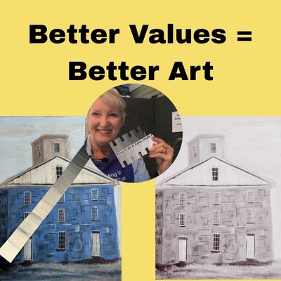
In painting, value refers to how light or dark a color is, and it’s the foundation of everything that works visually in your art. You can paint with just black, white, and blue and still create a stunning piece — because it’s the contrast in values that makes objects appear three-dimensional and believable. That and other ways to understand and use values are demonstrated in the video below.
Why Value Matters More Than Color
Value does the heavy lifting yet color gets the credit. Values are the lightness or darkness of a color. Every item in your painting needs a minimum of three values. If you have a red vase, in order for that red vase to look rounded, the color has to shift across the vase as the light hits it. The color in the red vase could shift from an orange or pink to a deep red. That color shift will be one of the things that will give your vase depth and perspective.
Values are what makes a mountain look far away, a face look realistic, or a flower look like it’s catching the light just right. Without good values, even the most beautiful colors fall flat.
Get the PDF to help you use values to improve your paintings at the end of this article.
A Common Beginner Mistake
Many beginners focus on choosing the “right” color, but skip over whether that color is light enough or dark enough to make the painting work. If your sky and your trees are the same value, they’ll blend together, no matter how accurately you mixed the green or blue.
The fix? Start paying more attention to value first, color second.
How to Practice Seeing Value
-
Squint at your reference photo or painting — this helps simplify the scene and lets you see the light and dark areas more clearly.
-
Work in black and white now and then — it sharpens your value judgment.
-
Convert a photo to grayscale before you paint from it. This removes color distractions and helps you plan.
Build Stronger Paintings
If you want more impact in your acrylic paintings, don’t just ask, “Is this the right color?” Ask instead, “Is this the right value?”
Because better values = better art. Every time.
Get the free downloadable printable PDF on how to understand and use values to improve your art. Click HERE to get the PDF.
Sharon Durbin Graves
P.S. Here’s another blog post on mixing color.